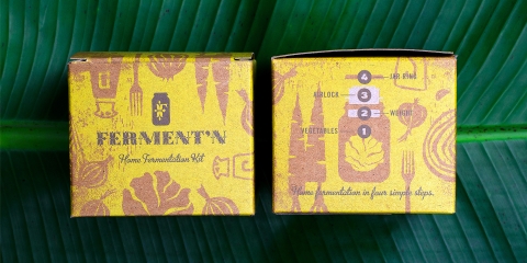
Ferment’n
branding, packagingFerment’n

_____
Cultivating the new kitchen culture.
All across the country, a new crop of consumers are proving that healthy eating is more than simply a hot trend. Ferment’n takes aim at this emerging food culture and facilitates a way for them to be more aware of and connected to the simple and fun ways that make food exciting. We were asked to invigorate the brand and better communicate its unique story, reveal the simplicity of the fermentation process and to create more engagement with the consumer. Through the use of bold and expressive typography, the brand mark provides impact and distinction on the shelf. The hand drawn veggies, mason jars and kitchen sundries not only help to educate, but also embody a sense of warmth and nostalgic familiarity. Overall, the tone is welcoming and energetic with a cool “foodie” vibe while still remaining true to its essence: pure simple fun that aims to change the face of eating healthy.

Scope
- Branding
- Logo
- Package Design
- Illustration
- Photography
Related Projects
We’re pretty good in the kitchen, too. Say hello »