


Lander-Jenkins
branding, packaging, printLander-Jenkins

_____
Good for the land, good for your glass.
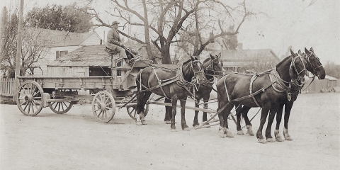
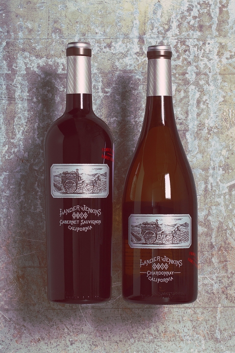
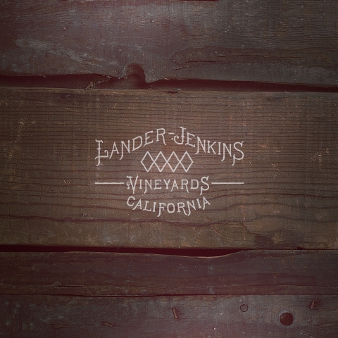
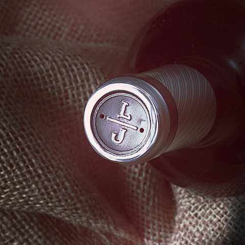
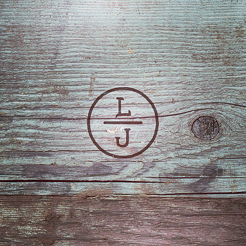
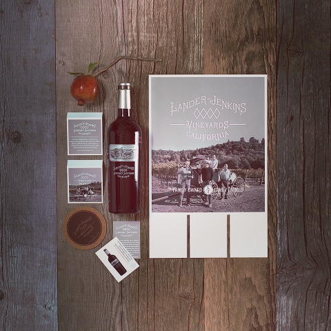
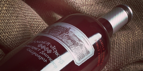
At its essence, Lander-Jenkins is the story of the land and the family behind a wine. Before establishing roots in California’s wine country, the Jenkins family ranched and farmed in Lander, Nevada—establishing an agricultural style based on doing things “the natural way” which carries over to their vineyards today. The refreshed packaging needed an identity which reflected this history and tradition. Respecting these passions required presenting the nostalgia and unvarnished aesthetic of their pioneer beginnings—but in a contemporary and inviting way. The product’s heritage is communicated not only by the engraving of a farmer transporting his harvest—but also through the use of quirky, Neo-Victorian typography. The austere approach to typography, a predominantly silver color palette and plenty of unused space results in a restrained but impactful presence on the shelf.
Scope
- Branding
- Logo
- Package Design
- Art Direction
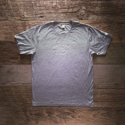
- Brand Swag & Applications
- Point of Sale
- Case Shippers
- Photography
- Illustration
Related Projects
_____
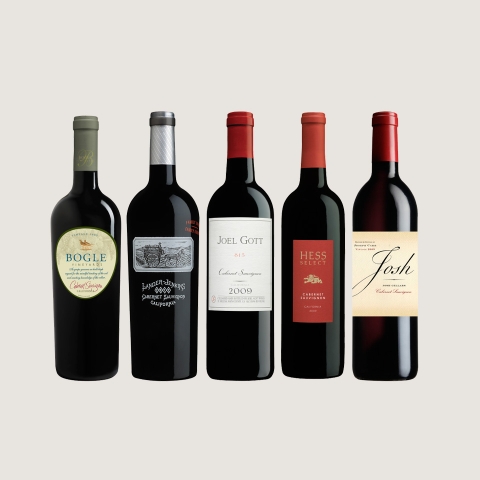
Lander-Jenkins Package Test
During research conducted by Wine Opinions, a panel of 960 respondents evaluated the new Lander-Jenkins package design against both the original package and a segment of the competitive set including Bogle, Hess, Josh and Joel Gott.
top line results
- New package ranked number one as “noticed first” followed by Bogle, Josh, Joel Gott and Hess.
- New package outranked Bogle two to one as “would pick up”.
- New package outranked the original package by more than two to one in attributes “this is a family winery” and “produced in a more environmentally-friendly way.” (Wine Opinions ranks these attributes with Millennials and Gen Xers as highly significant purchase motivators.)
comments
- “…very distinctive label and look that suggests something different in the bottle.”
- “…intriguing…looks like there’s a story/history behind it.”
- “…shows great attention to detail, it’s artfully designed. I think the wine would be the same way.”
What’s your brand’s story? Say hello »