


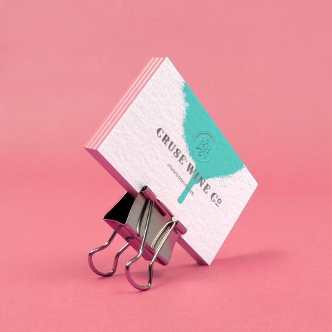
Cruse Wine Co.
branding, packaging, printCruse Wine Co.
_____
Twisting the familiar.
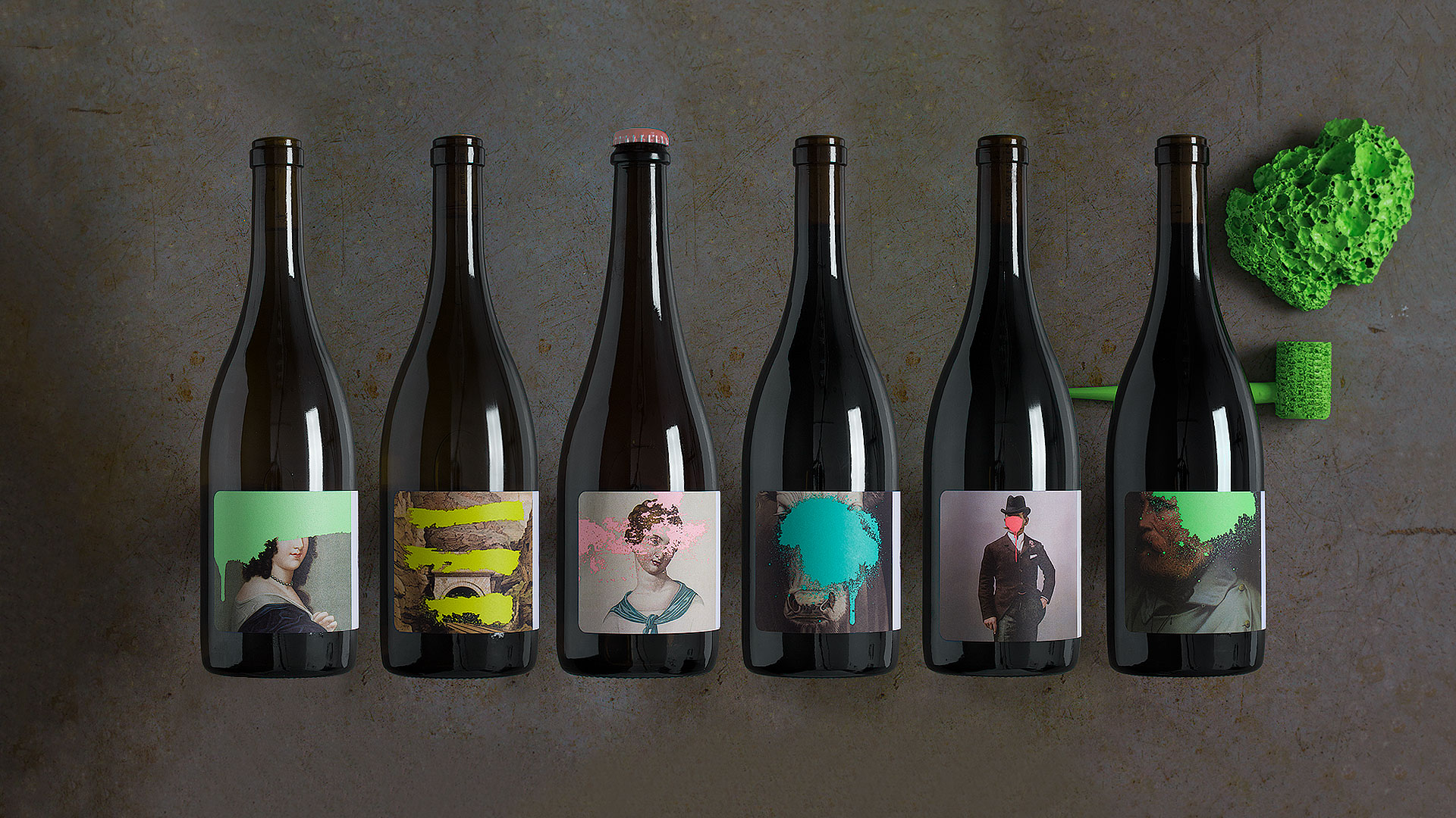
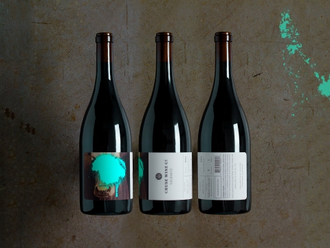
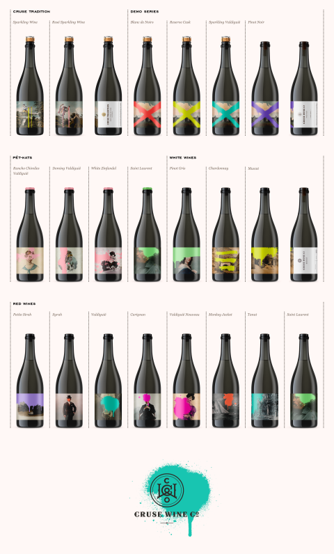
With the growing popularity of boutique wines, it has become increasingly important for small producers to embrace packaging that is expressive, intriguing and atypical. To do so, we drew inspiration from the Cruse Wine Company’s maverick attitude by contrasting tradition with irreverence. As winemaker Michael Cruse puts it, that juxtaposition reflects his goal to “return to California roots and California classics…but doing it in a modern way.”
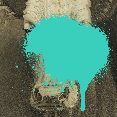
Because the winery also specializes in rare varietals such as Valdiguié and Saint Laurant, we recommended an image-dominant label to encourage curiosity. So instead of a consumer asking themselves “What is Valdiguié?”, they ask “Is that a cow?” The cow is familiar and familiarity warms them up to exploring something new. On a humorous note, we once overheard a customer ask her friend “What’s Valdiguié?”. Her friend replied “I don’t know, but the label looks great. Let’s try it.”


Scope
- Branding
- Logo
- Package Design
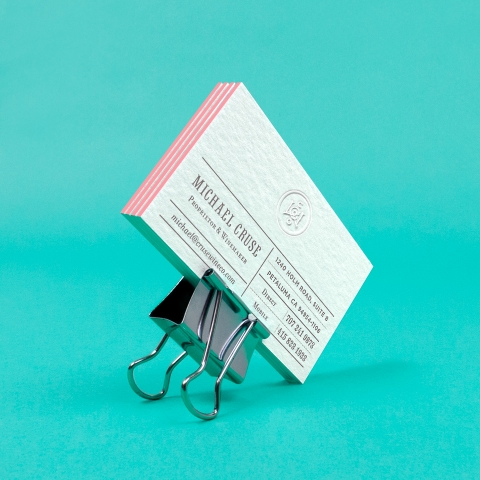
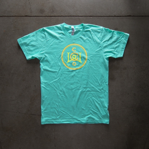
- Brand Swag & Application
- Photography
What’s your favorite color? Say hello »